Ah, Sinful Colors. I love you so much for being insanely affordable with amazing colors. I have a love/hate relationship with your formula because it's so hit or miss, but thank you thank you THANK YOU for making Neptune pretty much flawless.
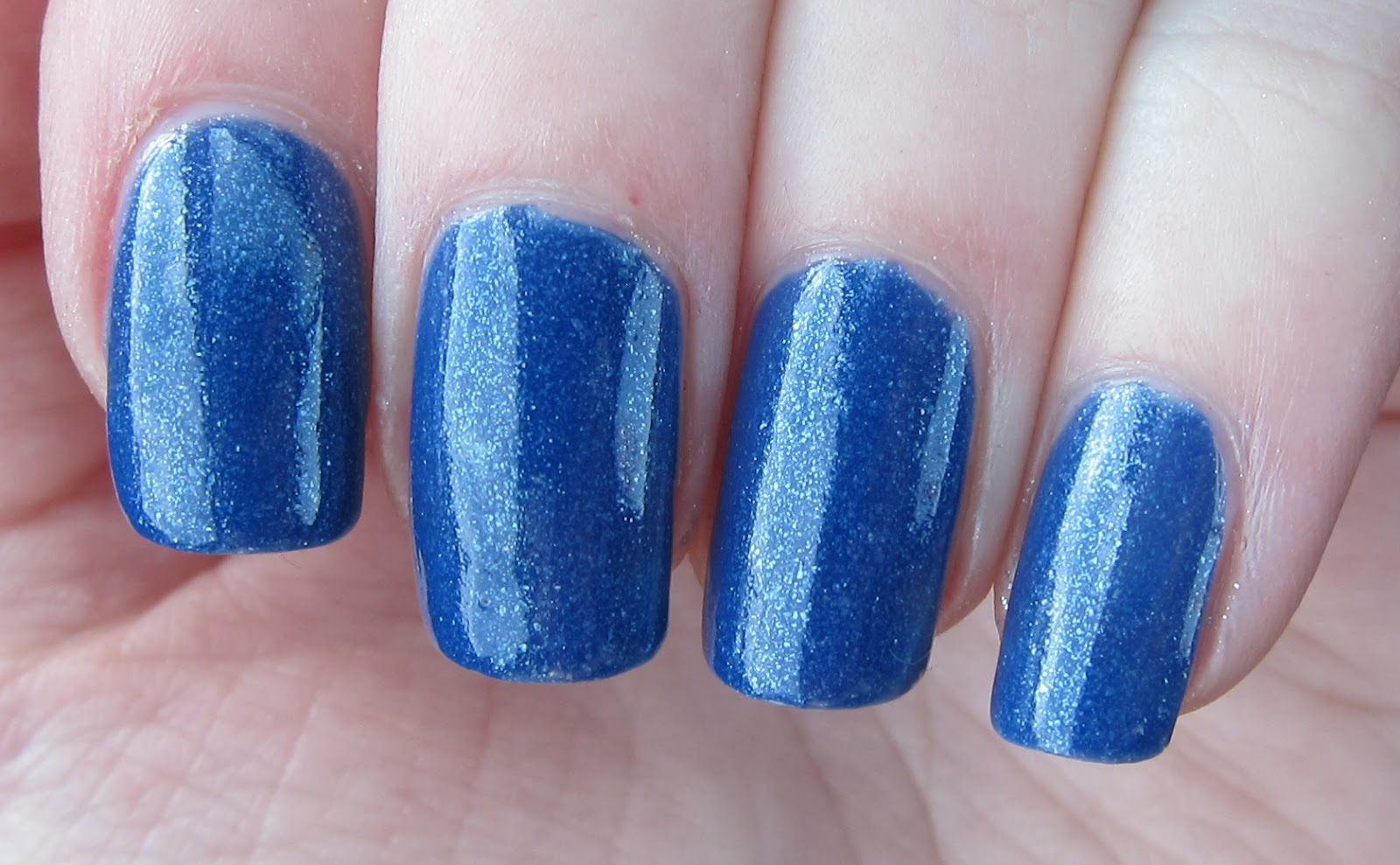
These pictures are 2 coats of Neptune. Slight tip wear, because it's day 2 of wear, I am always too lazy for top coat, and I play piano. But it was chip-free on day 4 when I took it off, so it's definitely getting my approval.
The last picture is the most color accurate. It wants to photograph really BLUE, and it's not. It's a little more cornflower-y than most of these pictures show. I tried to correct the next-to-last photo, but I think it's a little too purple, though still fairly accurate. The last picture shows that it is darker and a little richer than that electric blue in the first picture.
The first coat was streaky & ugly, but the second evened it all out. And what a GOREOUS shimmer. It's like the big brother of Essie Coat Azure or Smooth Sailing. In fact, I bet the three of them would make a gorgeous ombre!


No comments:
Post a Comment